TL;DR
Masonry — that Pinterest-style layout where every card has a different height and columns fill by shortest — has been a decade of frustration. Either you shipped 30 kB of JavaScript, or you reached for column-count and made peace with reading order going top-to-bottom instead of left-to-right. CSS Grid Lanes (display: grid-lanes) finally solves it in CSS, no JS, no resize listeners, with a two-line @supports fallback. This post walks through the syntax, how to ship it today, and where the trap is.
Why I even care
Over the last ten years I've built masonry layouts five times. Every single time it ended the same way: Masonry.js, Isotope, later a few hand-rolled requestAnimationFrame scripts. Every implementation had the same disease — before images finished loading, the layout jumped. ResizeObserver helped, but not fully. And when the design system grew SSR, we usually ended up with skeleton placeholders just to keep CLS under 0.1.
CSS columns looked like a rescue, but isn't. column-count: 3 fills a column top-to-bottom, so the reading order becomes: full first column → full second → full third. For a chronological gallery (Pinterest, blog grid) that's absurd. The user scans a row; we serve them a column.
The masonry spec has been dragging on since 2020. Safari Technology Preview shipped with grid-template-rows: masonry, and the Chromium team pushed back — they argued it glued two independent layout modes onto one property. A few years of arguing later, the result is display: grid-lanes: a dedicated display value, cleanly separated from regular grid, no hidden semantic traps.
How it works
The core syntax is trivial enough you can recite it in your sleep:
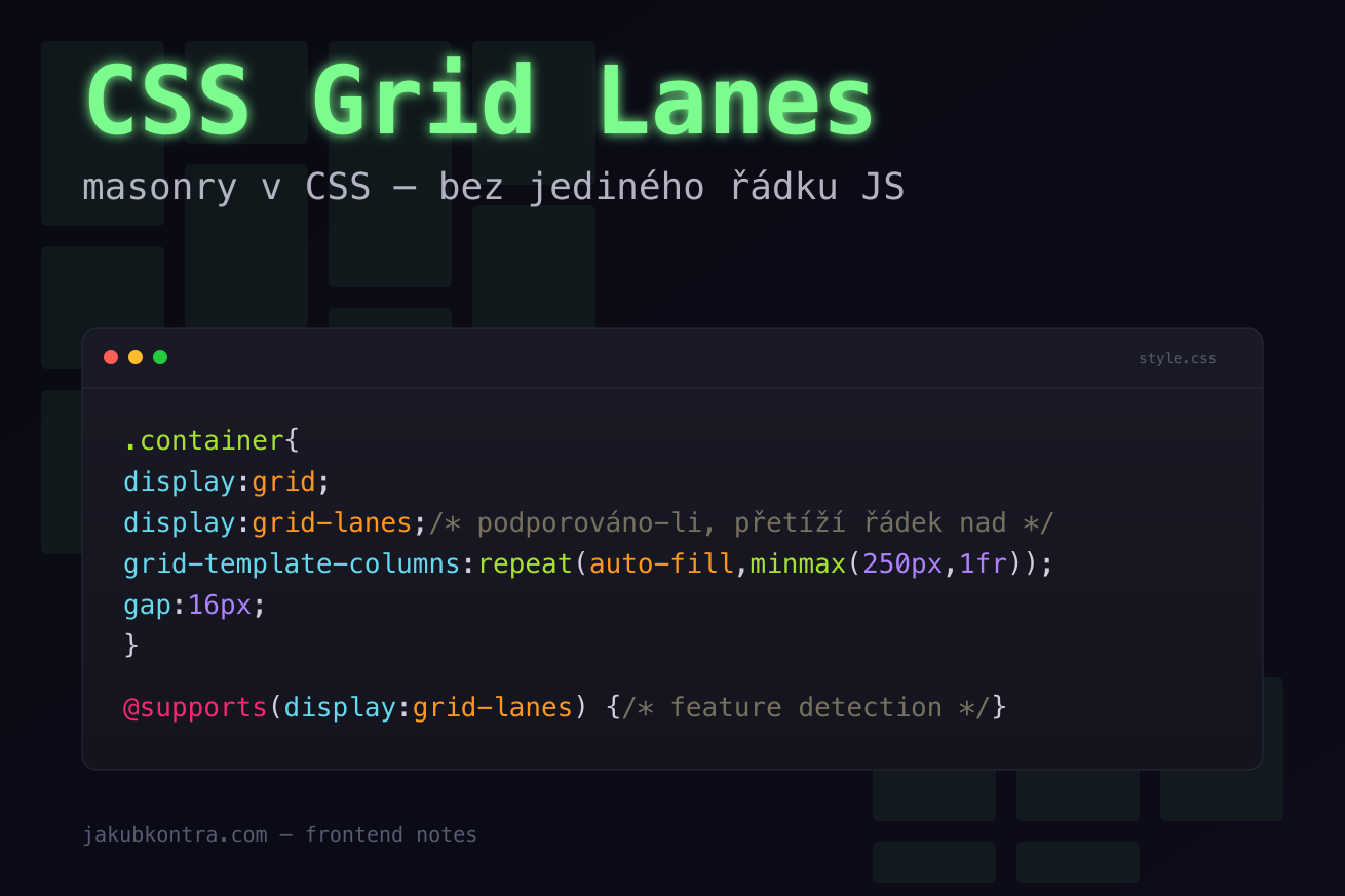
.container {
  display: grid;
  display: grid-lanes; /* if supported, overrides the line above */
  grid-template-columns: repeat(auto-fill, minmax(250px, 1fr));
  gap: 16px;
}
Three things worth explaining:
The double display: is progressive enhancement for free. A browser that doesn't know grid-lanes ignores the second line and stays on grid. No @supports, no JS. A new browser overrides the value above and gets masonry. This is the prettiest thing about the feature for me — you don't need to know who's running what version.
Lanes = columns. "Lane" is just another word for what you know as a track in a regular grid. grid-template-columns defines how many and how wide. repeat(auto-fill, minmax(250px, 1fr)) says: "if a 250px column fits, pack as many as you can, then stretch them evenly."
The fill algorithm. The browser walks items in DOM order and stuffs each into the shortest active lane. No exceptions, no global-height optimization — which is exactly what makes the layout deterministic. Reading order (DOM order) stays whatever you wrote: element N always comes before N+1.
Feature detection and fallback
Even with the double display:, sometimes you want older browsers to get a different layout (typically CSS columns or a plain grid). That's what @supports is for:
@supports (display: grid-lanes) {
  .gallery {
    display: grid-lanes;
    grid-template-columns: repeat(auto-fill, minmax(250px, 1fr));
    gap: 16px;
  }
}

@supports not (display: grid-lanes) {
  .gallery {
    /* fallback — CSS columns or plain grid */
    column-count: 3;
    column-gap: 16px;
  }
  .gallery > * {
    break-inside: avoid;
    margin-bottom: 16px;
  }
}
Worth noting: break-inside: avoid on children. Without it, CSS columns will tear a card across two columns — exactly the kind of demo you'd never want to show a client. Plus margin-bottom instead of gap — column-gap doesn't control vertical spacing inside a column.
For clients still demanding IE11 or a decade-old Android browser (they exist, trust me), that's the absolute ceiling. I'm not doing anything more for them.
Pinterest gallery — full example
<ul class="gallery">
  <li><img src="/img/1.jpg" alt="" /></li>
  <li><img src="/img/2.jpg" alt="" /></li>
  <li><img src="/img/3.jpg" alt="" /></li>
  <li><img src="/img/4.jpg" alt="" /></li>
  <li><img src="/img/5.jpg" alt="" /></li>
  <!-- … -->
</ul>
.gallery {
  display: grid;
  display: grid-lanes;
  grid-template-columns: repeat(auto-fill, minmax(220px, 1fr));
  gap: 12px;
  list-style: none;
  padding: 0;
  margin: 0;
}

.gallery img {
  display: block;
  width: 100%;
  height: auto;
  border-radius: 8px;
}
That's the whole thing. No JS, no ResizeObserver, no jumps on load. The image sets its own height via aspect ratio, and grid-lanes drops it into the shortest lane. If you add aspect-ratio on the <img> itself, you also eliminate CLS before images download.
When not to use it
Masonry is a tool for visually filling space, not for structured data. Three situations where you shouldn't reach for it:
- Tables and metric dashboards. If you need rows to actually be rows (comparing numbers across cards), masonry will misalign them. Use a plain grid with
grid-auto-rows: 1fr. - Forms. Input fields have a fixed vertical flow. Masonry adds zero value.
- Anything with drag-and-drop reordering. The algorithm is deterministic, but an item's position shifts based on neighbors' content. That makes reorder UX unpredictable.
Rule of thumb: if a wrapped row carries meaning, don't use masonry. Galleries, blog grids, dashboard widgets with independent content — yes. Anything else — probably not.
Wrap-up
Masonry in CSS is one of those changes I've been quietly rooting for for a long time. Not because it saves products — Masonry.js worked. But it's one more package, one more render hook, one more source of jumps. This feature wipes it out of the bundle, and I get a few kilobytes back plus the peace of mind that the engine computes the layout, not my code.
If you're building a gallery, blog grid, or card layout with uneven heights, shipping display: grid-lanes with an @supports fallback is now a five-minute job. And that fallback will still be needed for another year or two.
One less reason to pull in JavaScript.